SEGARI
Optimizing Delivery Riders’ Experiences
Revamping Internal Driver App for a More Streamlined Operation and Increased Delivery Timeliness
Company
as UI/UX Design Intern @ Segari
Platform
Mobile Apps
My Role
UX Research, UX Design, UI Design
Tools
Figma, Google Meet
Timeframe
2 Months
Introduction
Segari is a commerce grocery start-ups in Indonesia, delivering fresh produce to consumers around Jakarta, Tangerang, and Bekasi areas.
As an intern, I was tasked with redesigning their internal mobile app—a critical tool for their logistics and fulfillment teams—to help them scale efficiently and effectively."
Project Objective
Revamp the existing app and create a more intuitive and user-friendly experience that would streamline operations and their entire logistics process.
01 / The Process
Meeting with the Segari riders was a powerful experience. I spoke with 12 of them, from 19 to 55 years old, and heard firsthand about the challenges they faced navigating the city and managing deliveries.
These conversations provided crucial insights into their workflow, their needs, and the frustrations they encountered with the current app.
6/12 Riders
encounter difficulties in locating delivery address.
6/12 Riders
feels that the the note section on the address is useful but need further emphasis
11/12 Riders
had problems in dropping orders; cannot upload photo, unable to finish orders. With no information regarding the error.
2/12 Riders
feel overwhelmed because they had to fill many forms in the app for proof when dropping an order
The App Design (Before)
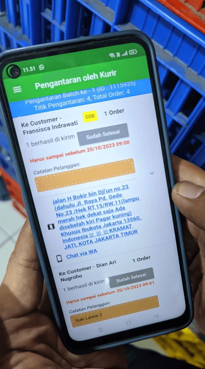
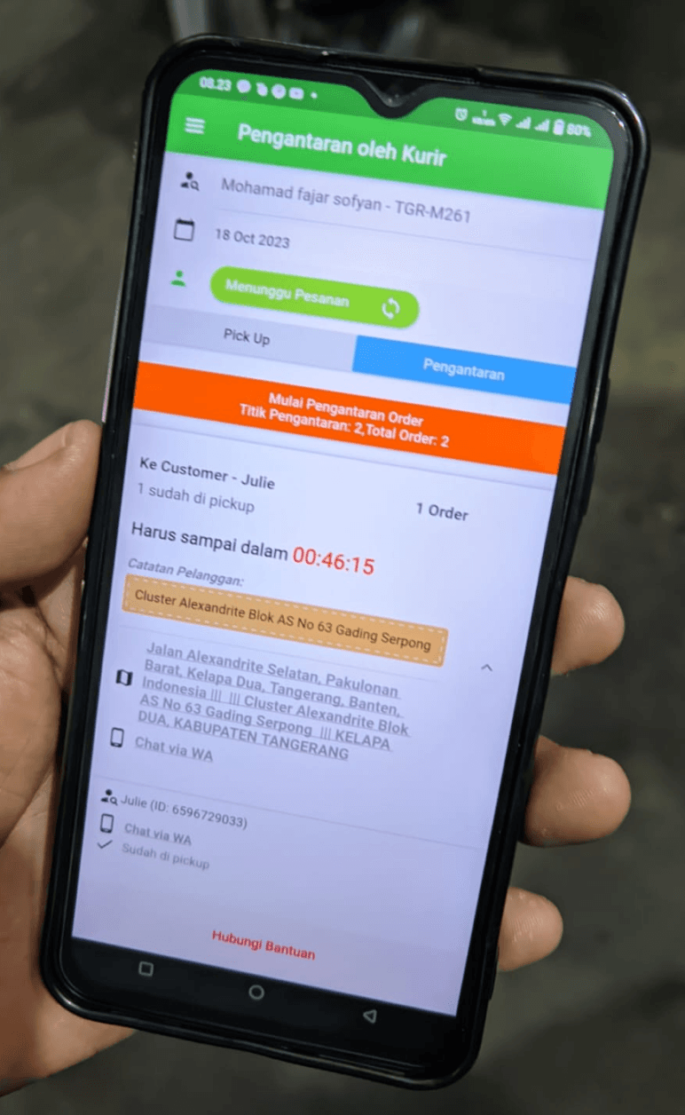
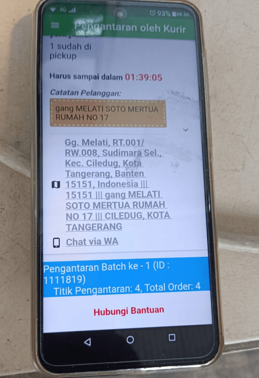
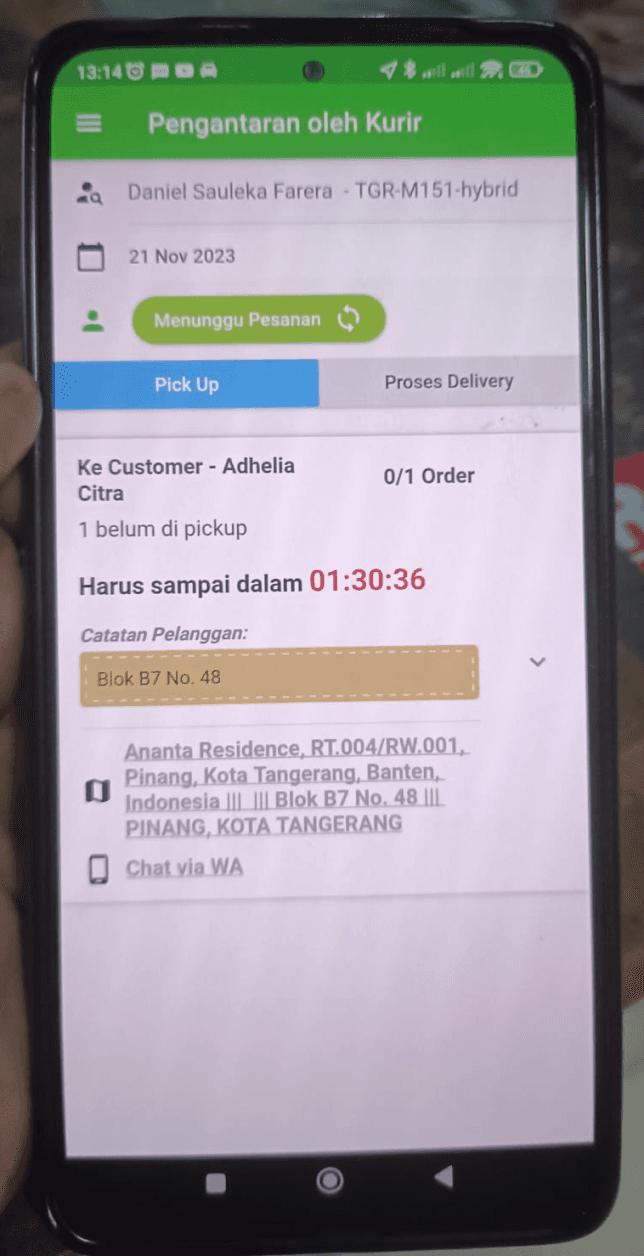
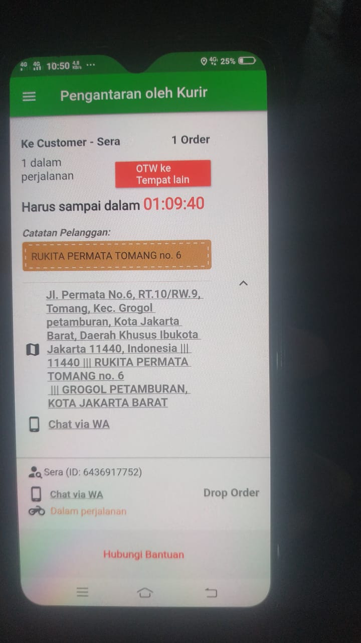
The findings? 💡
Poor Information Hierarchy
Unorganized information that confuses users, affecting delivery timeliness
Frequent system error and unclear error messages
Riders were constantly battling system errors, often with cryptic and unhelpful error messages.
Complicated App Navigation & Forms
Not intuitive design, hard to navigate especially for new users. Complicated flow and forms filling that made longer delivery time
02 / Define
Who Are the Riders?
While the user base was primarily Segari's riders, they weren't a homogenous group. Our interviews revealed a wide range of ages, from young adults just starting out to seasoned veterans. This diversity in age, tech literacy, and problem-solving approaches presented a unique design challenge: how to create a solution that would be intuitive and effective for everyone, regardless of their background.
Below are the user persona(s) based on my interviewees:
Name: Fajar Putra
Age: 25
Occupation: Riders
Education: Highschool
Location: Tangerang Selatan, Indonesia
Description
Fajar is a motorcycle courier with 4 months of experience working on a e-grocery startup. Everyday, he would pick up several batch of orders, delivering orders around South Tangerang & Tangerang area. He would start working at 06.00 am and would continue until end of the day, typically ending around 9 pm. He is a very motivated person and values efficiency.
Needs & Wants
Delivering the orders as quickly and accurately as possible.
Easy and simple navigation in the app as he is constantly on the road.
Clear direction regarding the order and communication with customers.
Pain Points
Hard to locate customer’s delivery address because of confusing address information.
Frequently encountering unknown application error while on the road.
Name: Ahmad Hidayat
Age: 40
Occupation: Riders
Education: Highschool
Location: Jakarta Barat, Indonesia
Description
Ahmad is a motorcycle courier with 1 year of experience working on a e-grocery startup. Previously, he had worked for 4 years as food delivery courier in a food delivery app. Everyday, he would pick up several batch of orders, delivering orders around West Jakarta area. Although generally he has a basic technological savviness, he has a vast understanding on driver’s app due to his years of experience on the road.
Needs & Wants
Delivering the orders as quickly and accurately as possible.
Easy and simple navigation in the app, direct organization of information as he is constantly on the road.
Clear direction regarding the order and communication with customers
Pain Points
Hard to distinguish information because of complex flow and navigation in the app.
Taking too long while dropping orders because having to fill many forms.
03 / Ideate
Driven by the riders' need for efficiency, our ideation sessions focused on creating solutions that would streamline their daily tasks and minimize friction points.
How might we
optimize the organization of information and creating a more efficient and user-friendly experience for drivers to eliminate user confusion?
How might we
enhance the app's design for improved intuitiveness, simplifying navigation to reduce complexities?
How might we
enhance the clarity of error messages in the app to help users with a better understanding of issues in the app?
Defining and Prioritize Solutions
We carefully considered each potential solution in light of the riders' varying levels of app familiarity and understanding, ultimately prioritizing those that offered the greatest potential for widespread adoption and ease of use.
High Impact
Low Effort
Low Impact
High Effort


Defining User Flows
To ensure a seamless and intuitive user experience, we mapped out the key user flows for the redesigned app. This involved visualizing the steps riders would take to complete various tasks, from logging in to confirming a delivery.
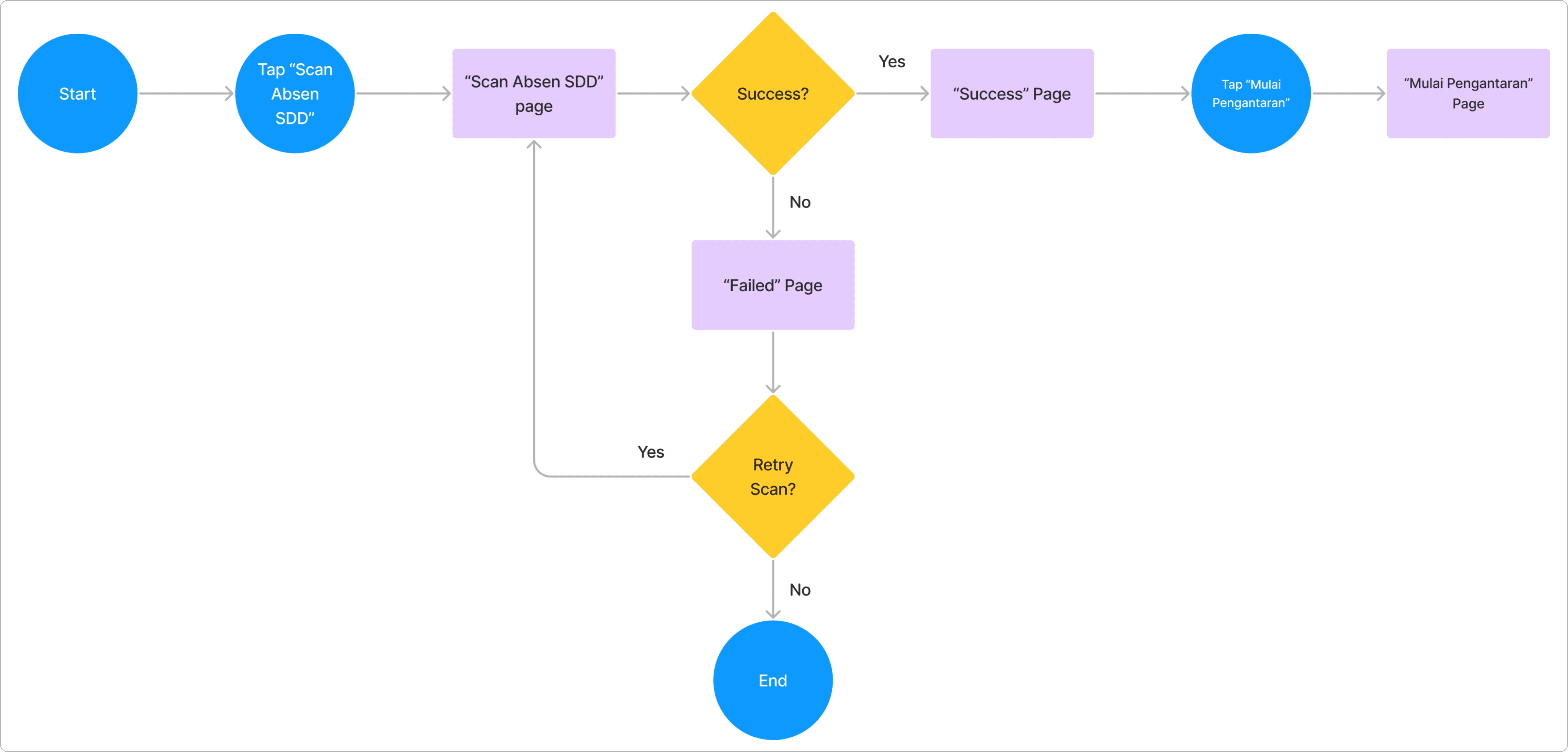
“Scan Absen”
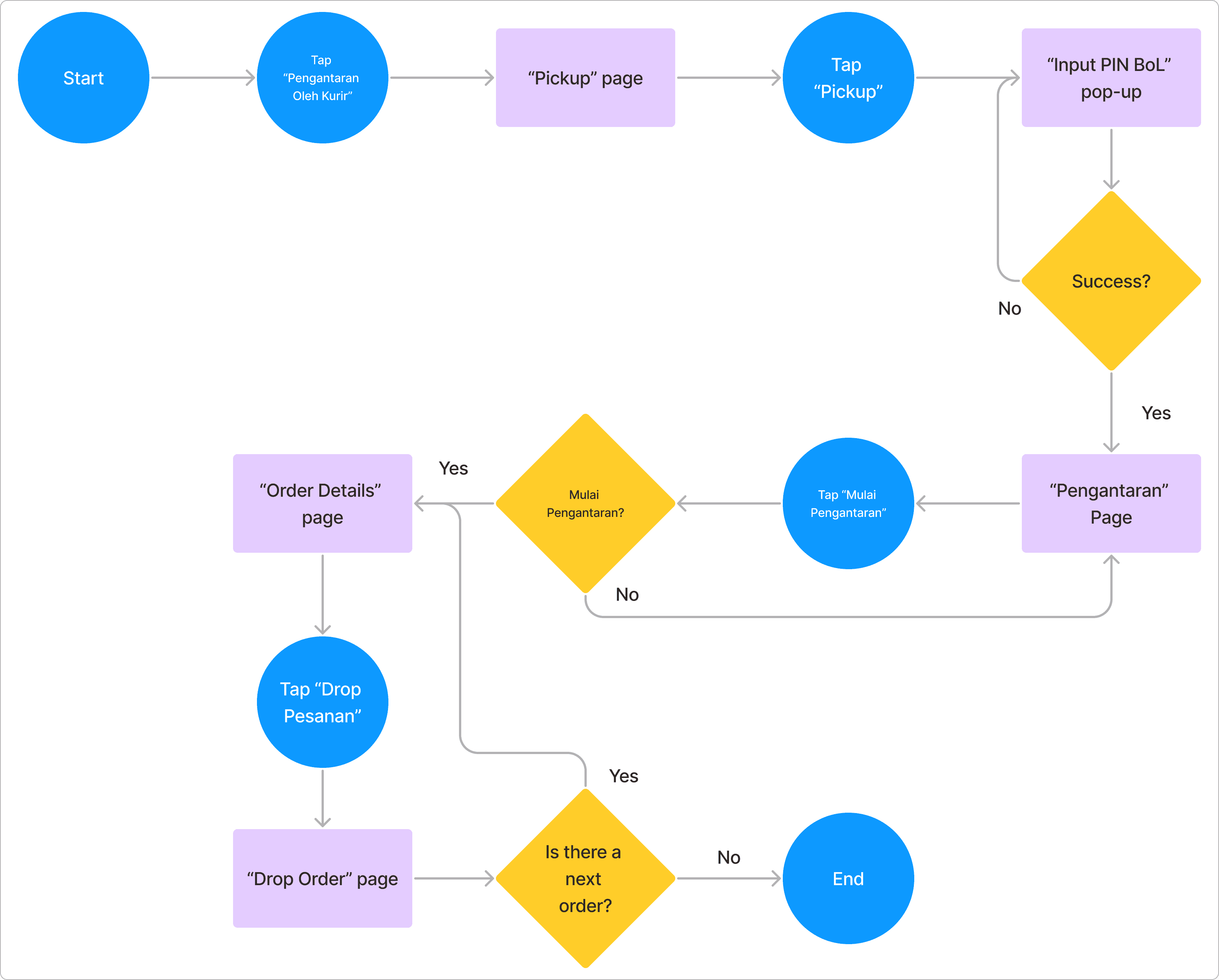
“Pengantaran”
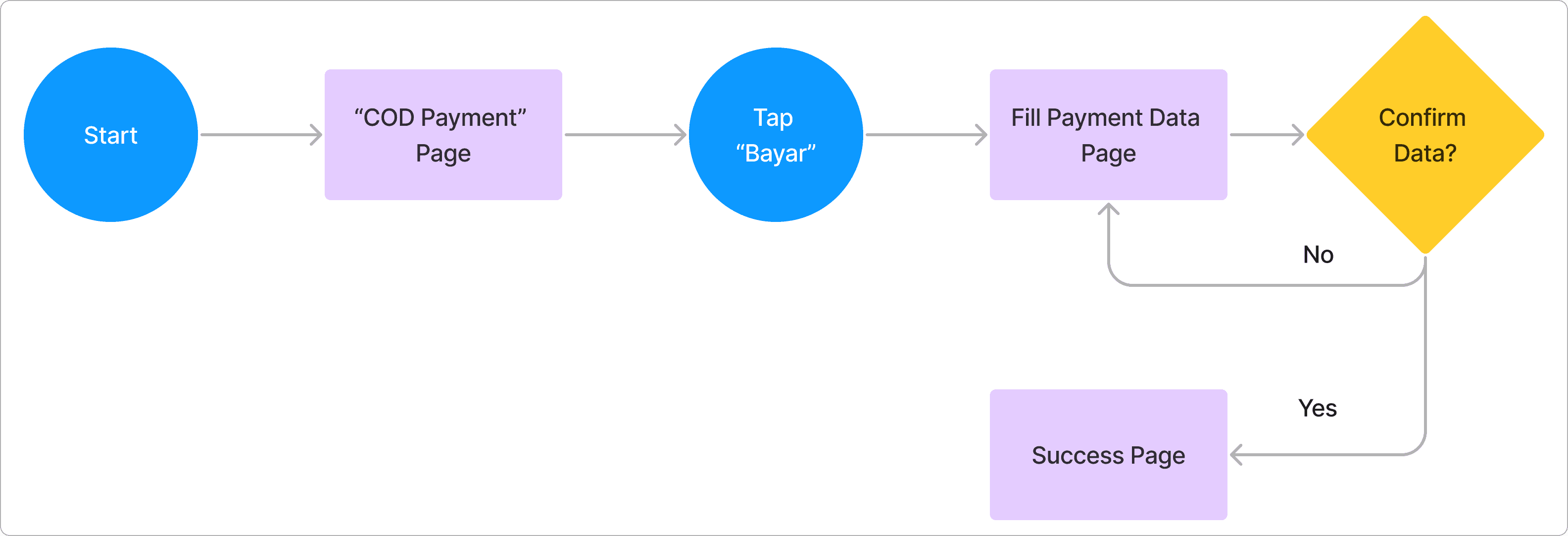
“COD Payment”
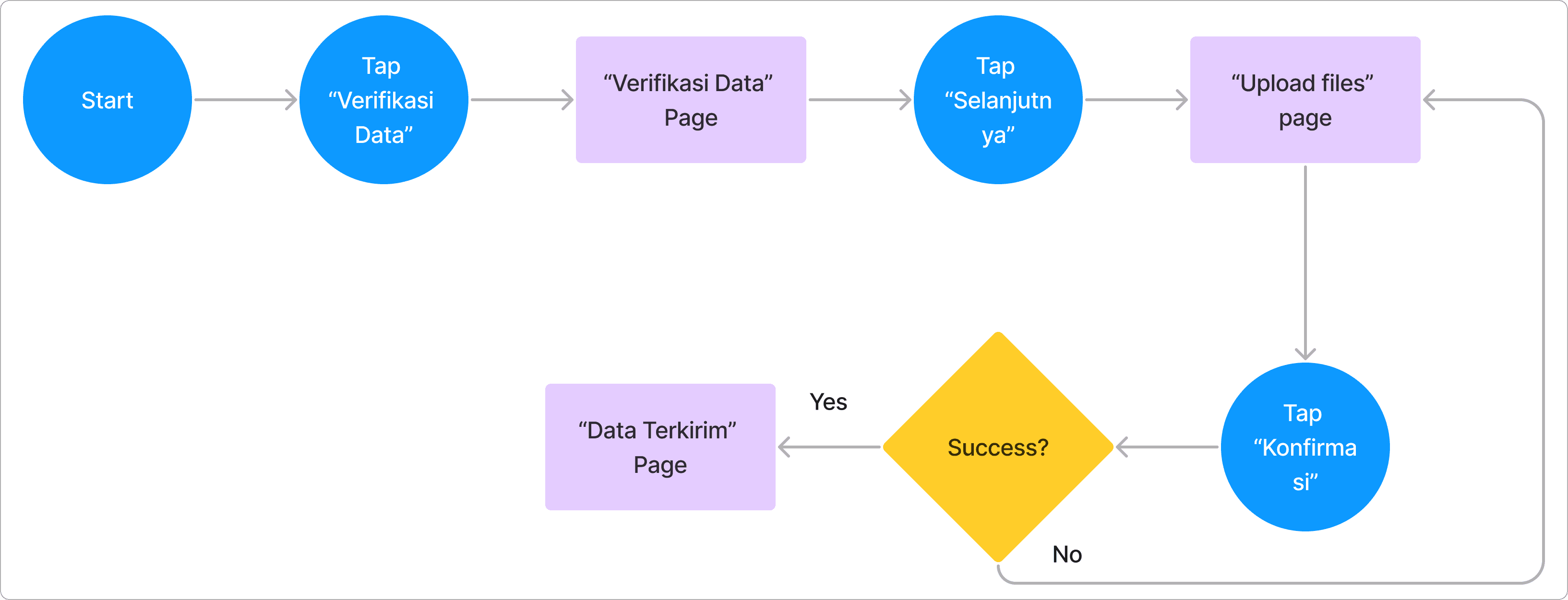
“Verifikasi Data”
04 / Solutions
I create a clean, redesigned information hierarchy. By strategically using visual cues, we emphasized the most essential features, ensuring seamless deliveries and dramatically easing the riders' overall workflow.
Design System
To create a more cohesive and modern interface, I developed a design system, including a component library, design guidelines, and a style guide. This resulted in improved aesthetics and usability.
Primary
buttons, CTAs, prominent texts
#0C7800
#48744D
#C2D8C2
#EBF5E9
Neutral
for text, borders
#1A1C18
#2F312D
#5D5F5A
#ABACA6
#C6C7C1
#E2E3DC
Accent
for errors, notifications, etc.
#93000A
#FFDAD6
#F8961E
#F9C74F
Roboto
Aa
Regular
Aa
Medium
Aa
Semibold
Aa
Bold
Roboto / 36px
Roboto / 32px
Roboto / 24px
Roboto / 20px
Roboto / 16px
Roboto / 14px
Roboto / 12px
A glimpse of the design system I established!
Button
Button
Button
Button
Button
Putri Caca
Rp150,000
24 Oktober 2023
09.05
Order ID:
2837493018
Batch:
02938344
Putri Caca
Rp150,000
24 Oktober 2023
09.05
Order ID:
2837493018
Batch:
02938344
Mulai Pengantaran?
07 November 2023
Batch ID:
02938344
Batch ke-1
7/7 Total Order
Batal
Mulai
COD
Harus Sampai Dalam:
00:43:44
COD
Prio
Turbo
Terlambat
Turbo
Customer: Putri Caca
Order ID: 2837493018
Jl. Kasuari 11 No. 14. Pondok Pucung, Pondok Aren, Kota Tangerang Selatan
Harus Sampai Dalam: 00:40:41
Rumah di paling ujung, warna kuning
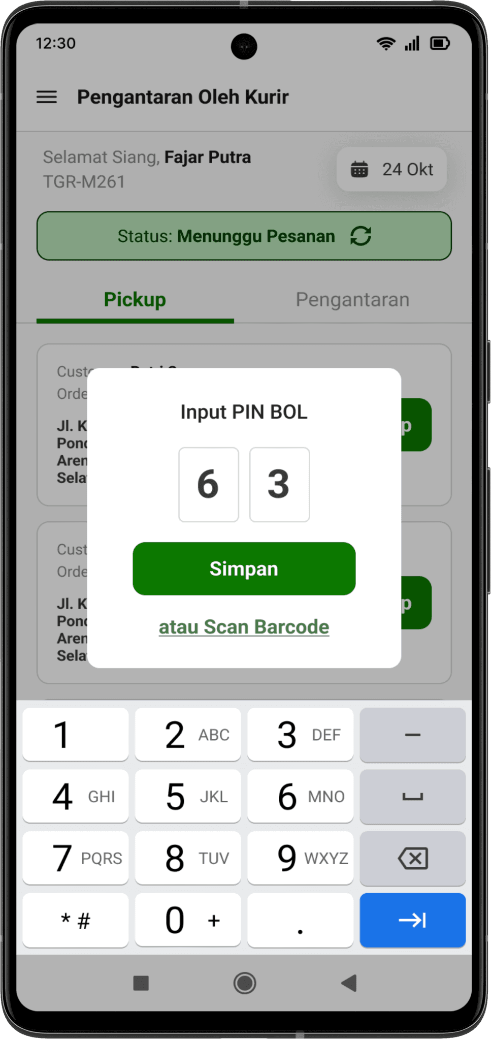
Input PIN BOL
6
3
Simpan
atau Scan Barcode
Akun Anda sedang diblokir
Hubungi tim logistik untuk keterangan lebih lanjut.
Hukuman ini akan berakhir dalam waktu:
52:12
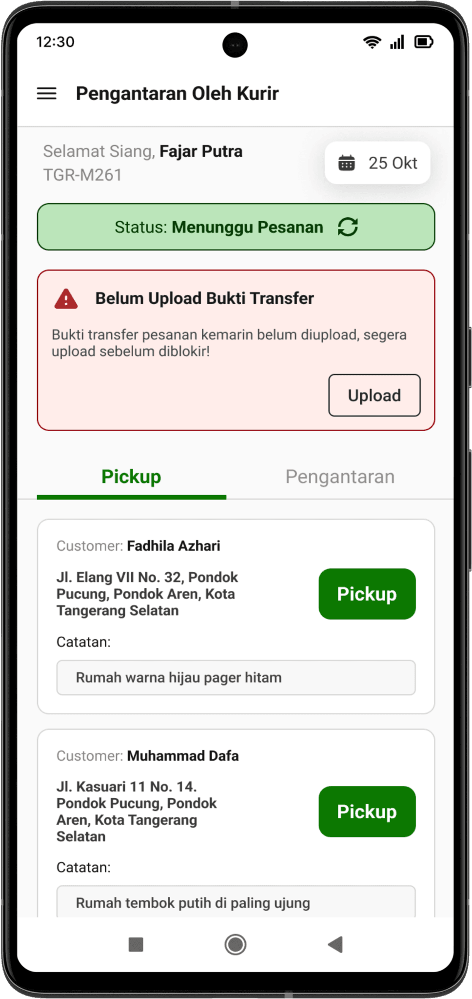
Belum Upload Bukti Transfer
Bukti transfer pesanan kemarin belum diupload, segera upload sebelum diblokir!
Upload
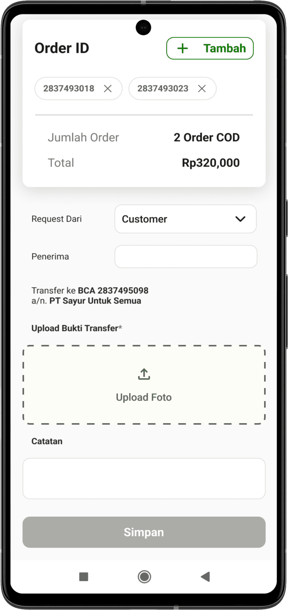
2837493018
2837493023
Nama Lengkap*
Status: Menunggu Pesanan
Belum Bayar
Kurang Bayar
Lunas
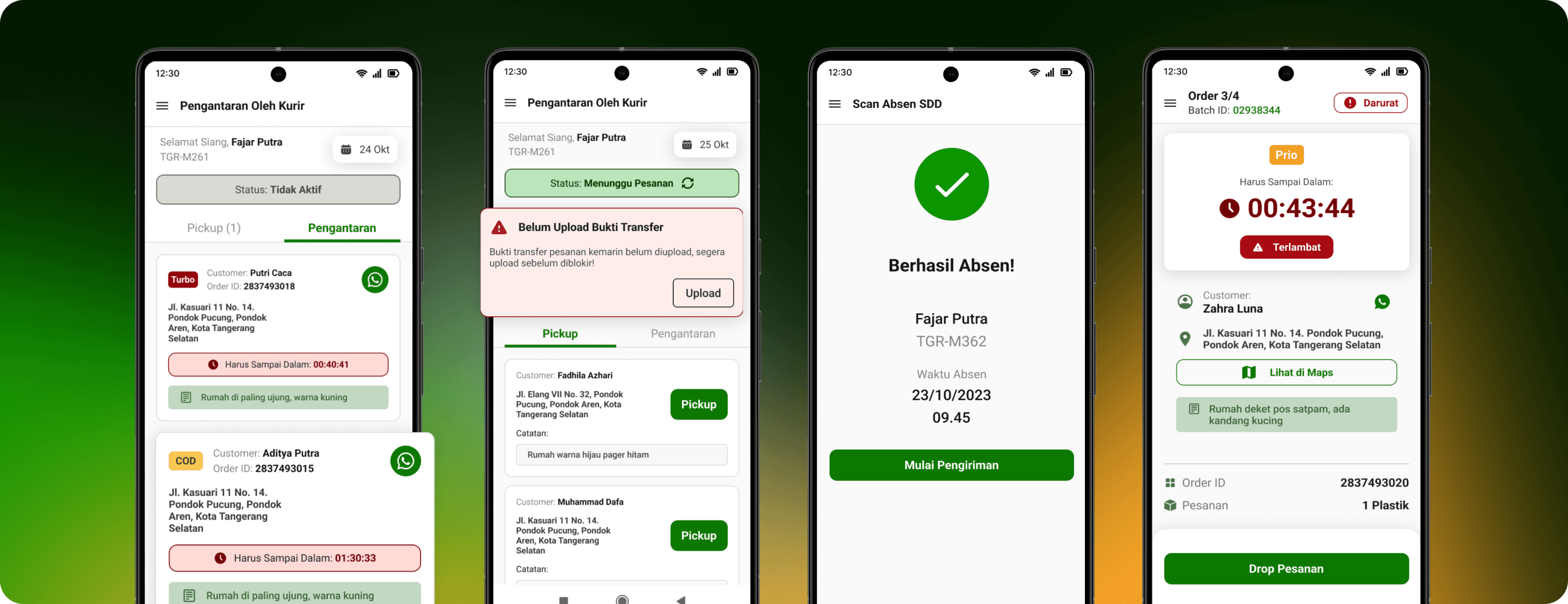
Design Solutions
Based on our insights, we developed the following design solutions to improve the rider experience.
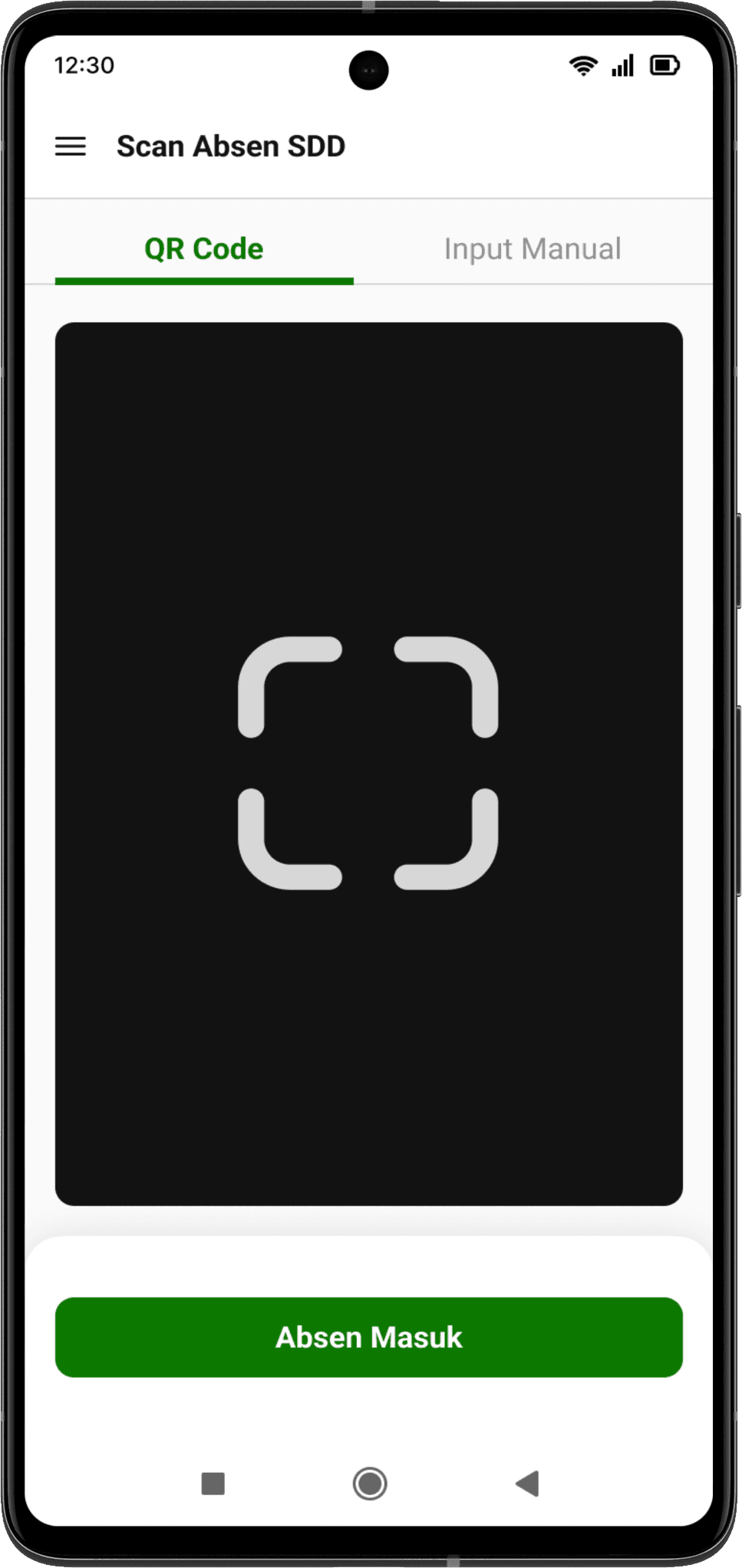
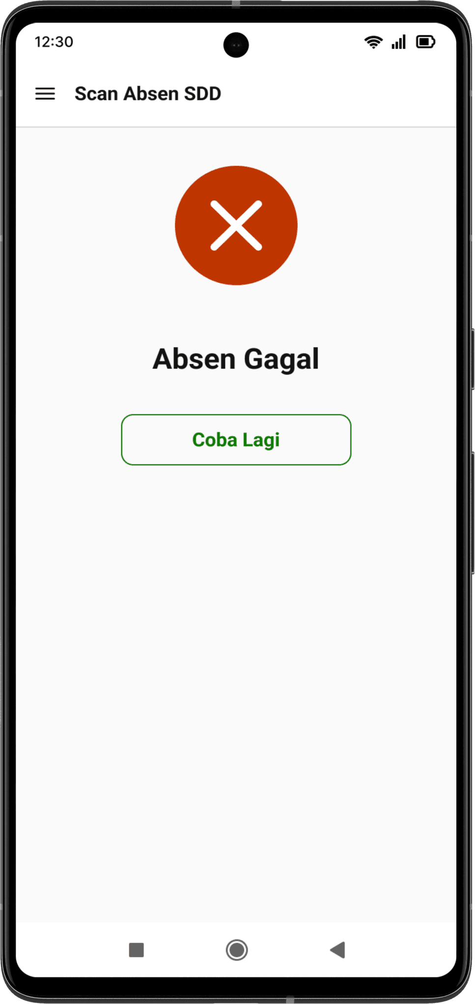
Attendance Scanning
Reorganized Information Hierarchy
Enhance the overall interface design to optimize user-friendliness, streamline navigation and reorganize the information hierarchy for improved accessibility for the users.
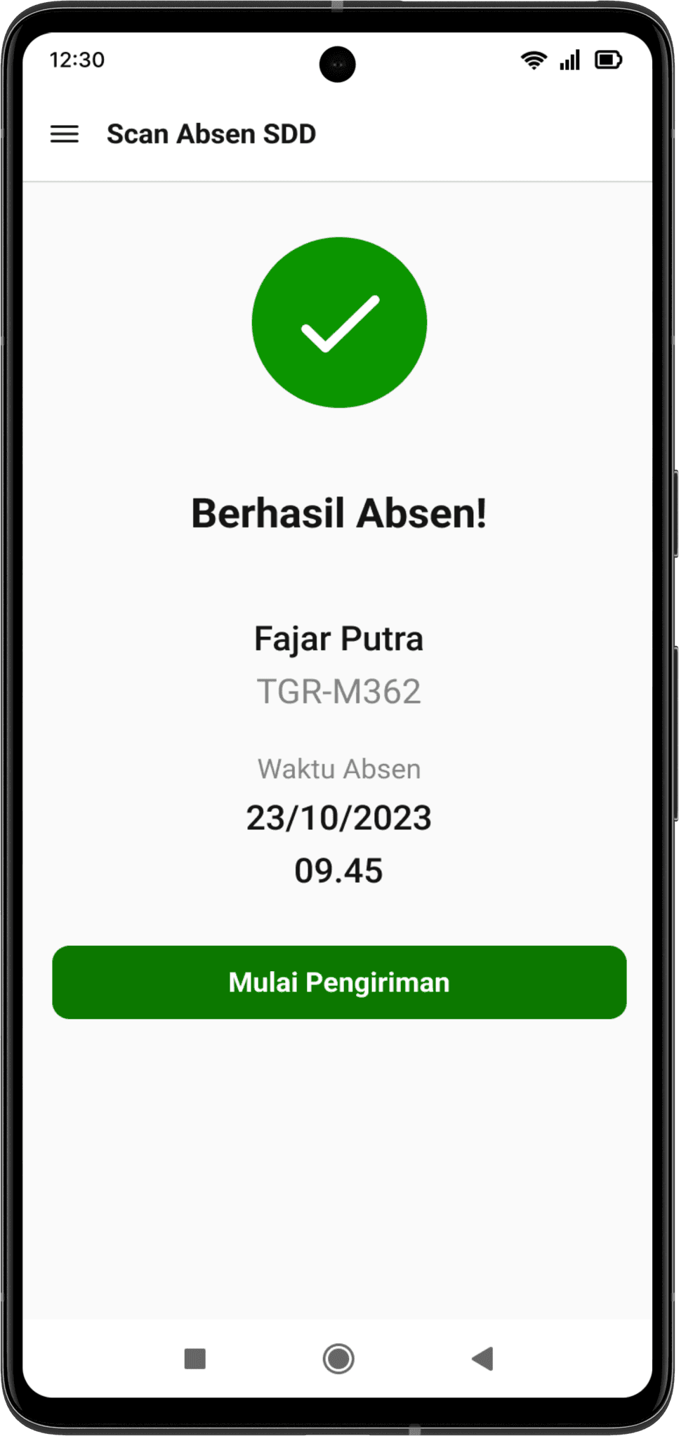
Notifications
Notification to inform the user whether they have successfully completed or failed to take their daily attendance. Represented visually with icons for quick identification.
CTA prompting users to proceed to the next step.
The CTA is used to direct users to take the next action and providing a straightforward path for users to follow.
Delivery Process
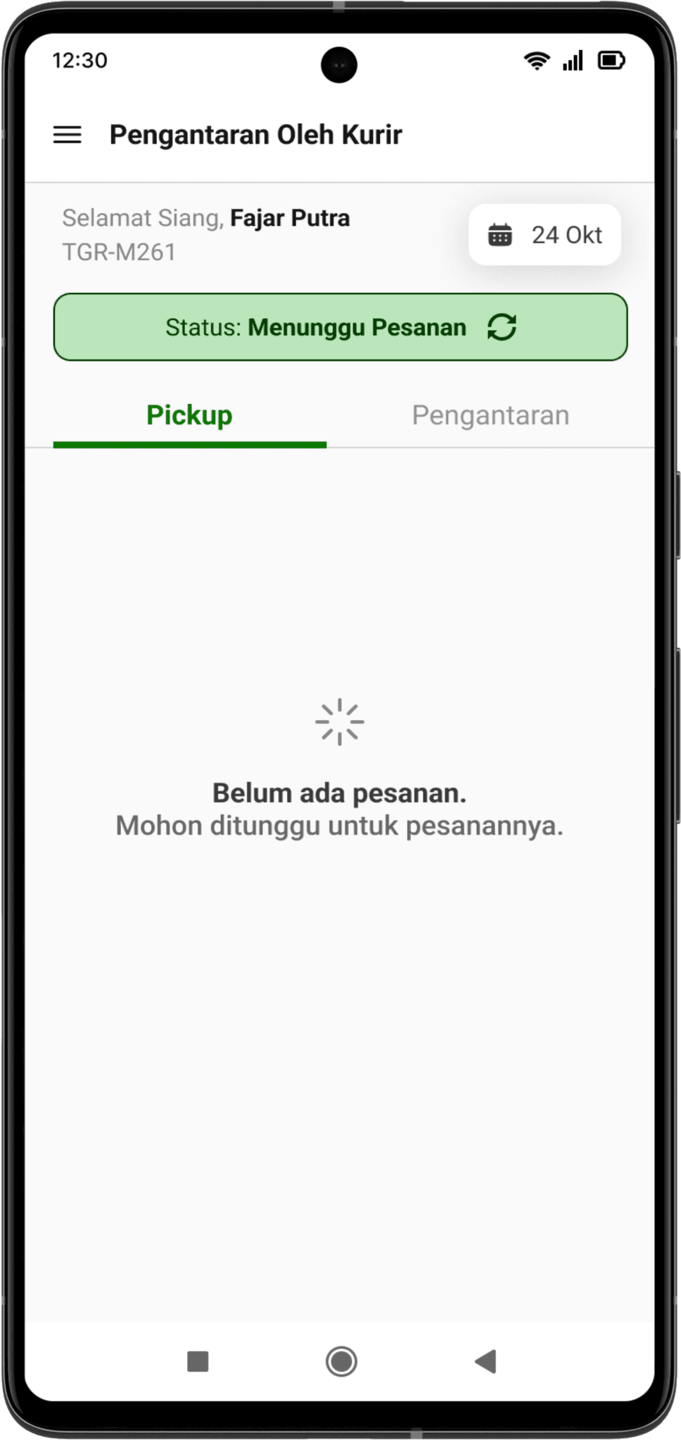
New Loading Page
A new loading page to inform users to wait for the assigned orders.
Clearer CTA
Redesigned CTA to pickup orders after the user has got the assigned orders. A clearer CTA provides a quicker direction to users.
Overall Interface Revamp
Overall interface revamp to give a more refreshed look compared to the outdated feel for more simplicity and intuitiveness.
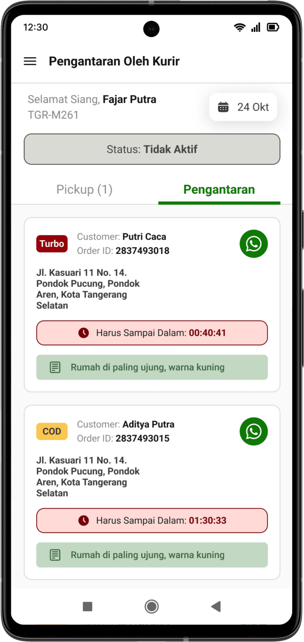
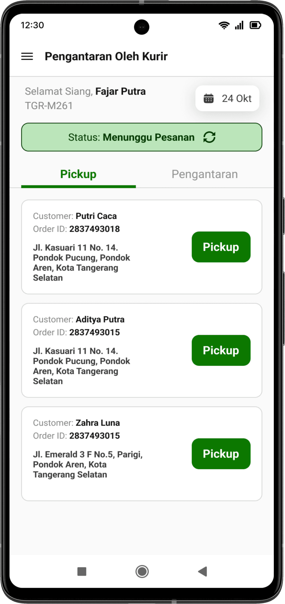
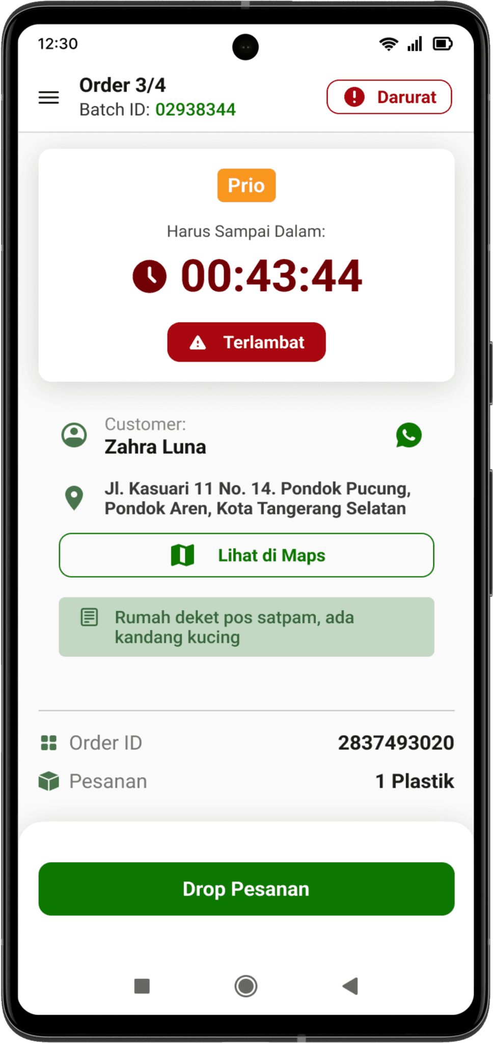
Order Information & Management
Orders are listed based from the assignment. The order information contains name, OID, and address. Also contains order category, visualized by chips and clear timer to make riders aware about delivery time.
Emphasis on customers notes & requests
Riders frequently rely on customer’s notes to find an address. Here the notes from customers are more emphasized to avoid confusion from riders and helps riders to quickly identify notes from each order.
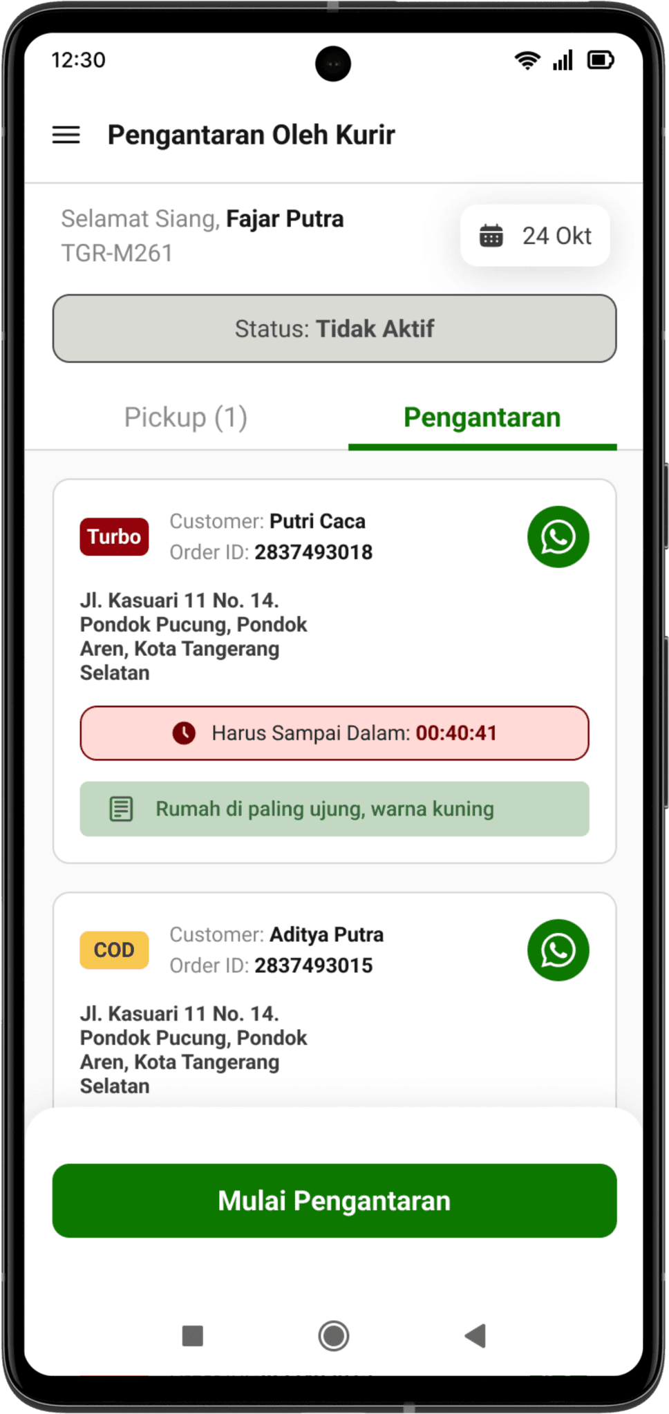
More Prominent CTA
CTA button to start delivery once all the orders in one batch are completely assigned to ensure easy access by users to start delivery as soon as possible.
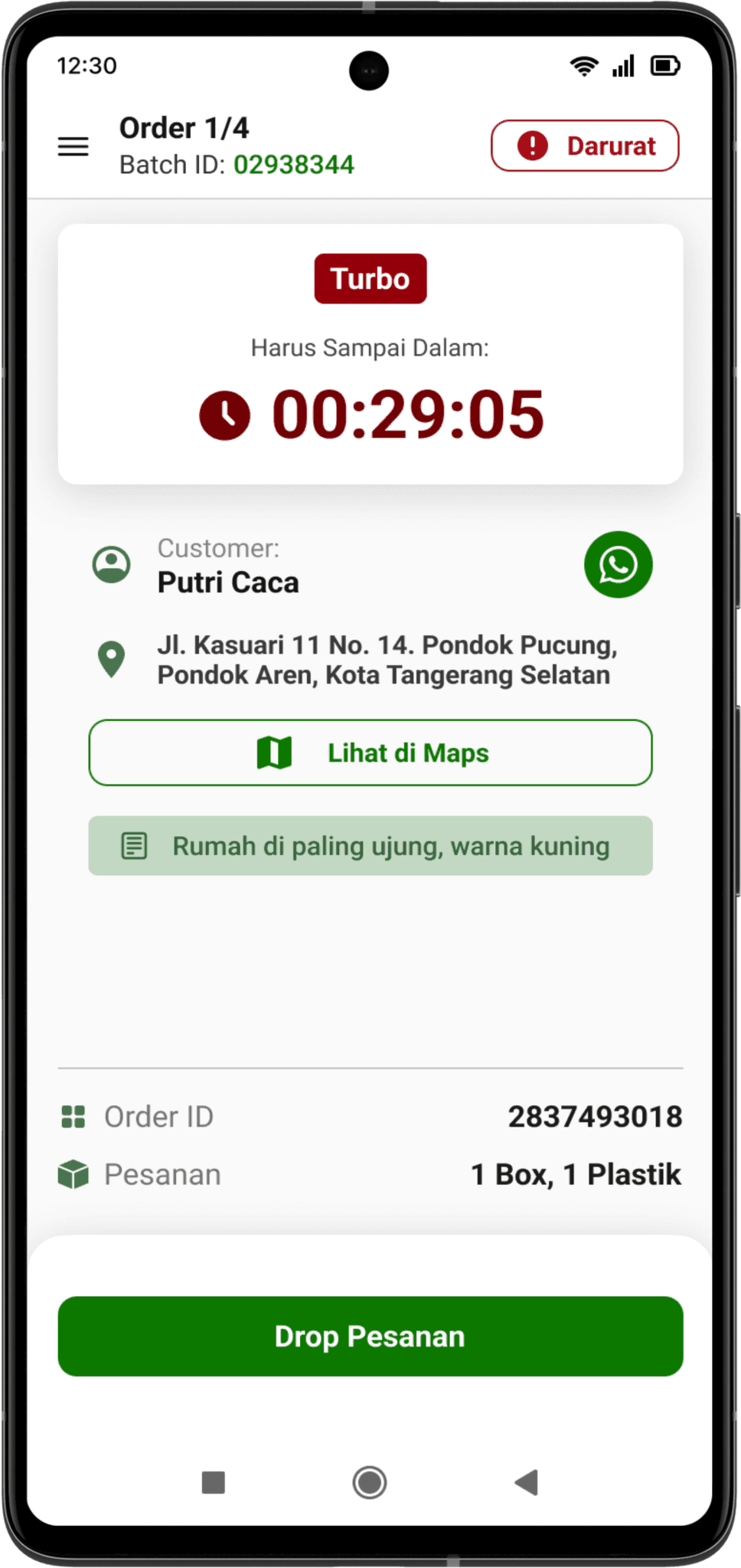
Order Timer
Enhance the order timer feature to effectively make users aware about delivery time thus encouraging users to deliver as soon as possible
WhatsApp Button
Users rely on WhatsApp to contact customers, thus the WhatsApp Button is more accessible to ensure quick and effective contact to customers
Late Indicator
Late indicator to warn users that they had delivered the order late, warnings are made prominent to make the users aware so they would deliver the order soon.
Order Dropping
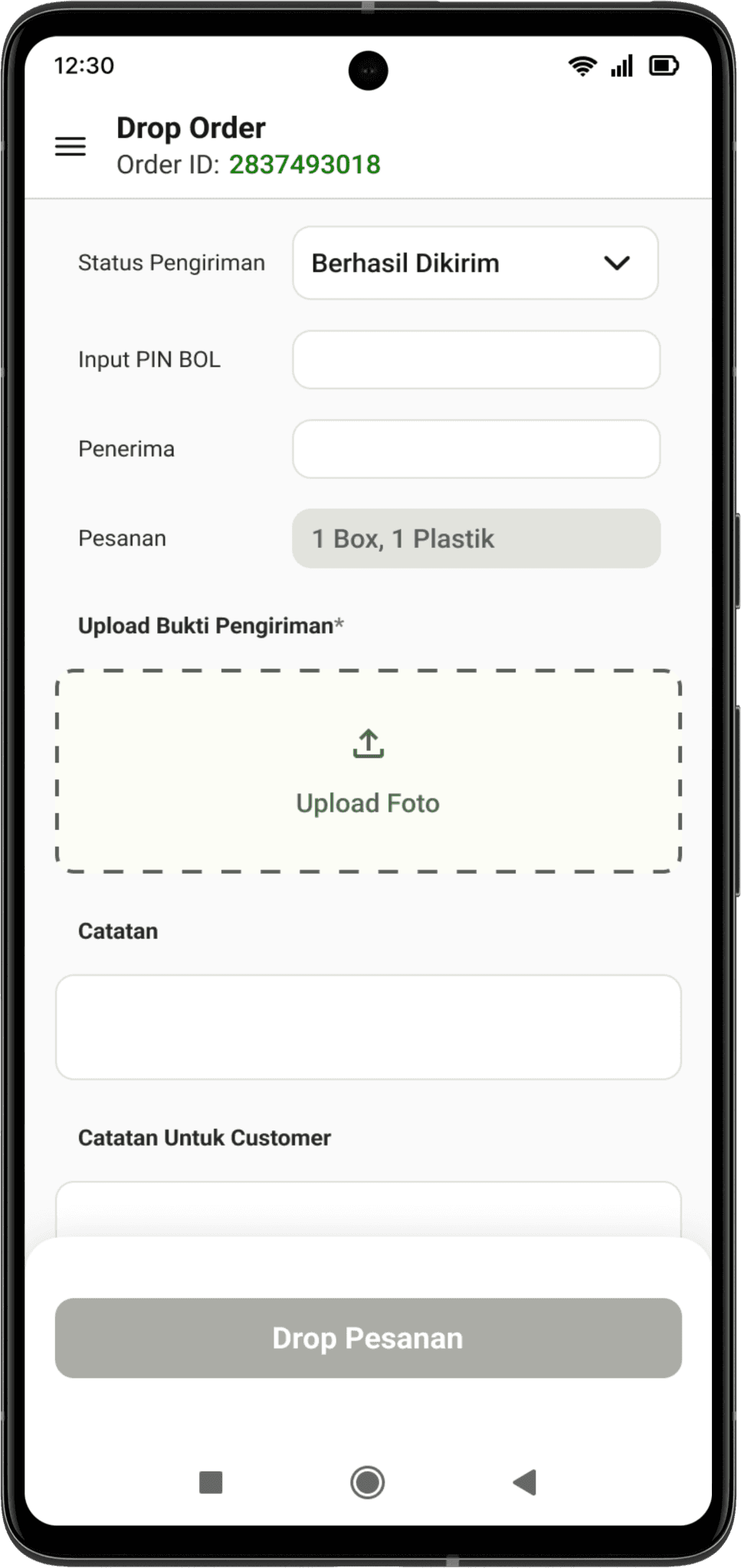
Form-filling
A more simplified form-filling for a seamless and efficient proof of delivery upload. Thus, this will increase delivery time, and user are able directly proceed to deliver the next order.
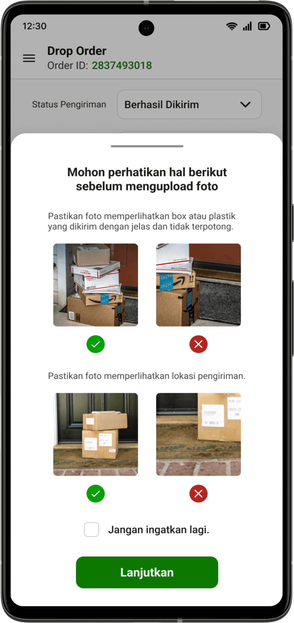
Pop-up Guidance
A pop-up is presented when user is about to upload a photo to inform users about photo upload guidelines.
Notification
A notification is shown when a user hasn’t uploaded the COD payment proof yet. The notification is prominent and would not dismiss until the user completed the action, thus encouraging user to take action immediately.
COD Payment
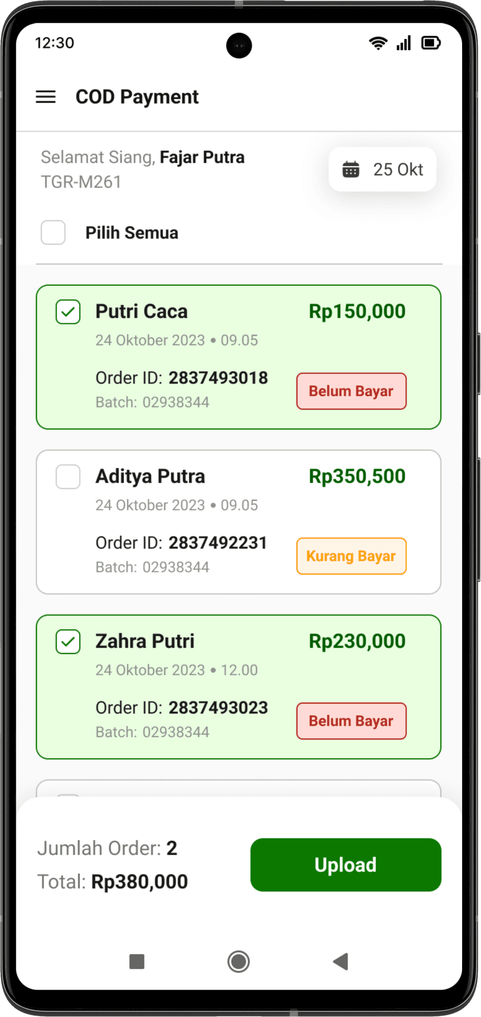
Manage Orders
Select one or multiple order to pay. In each orders a brief description is presented.
Reorganized Flow
Reorganized the flow and overall interface for a straightforward experience and easier understanding.
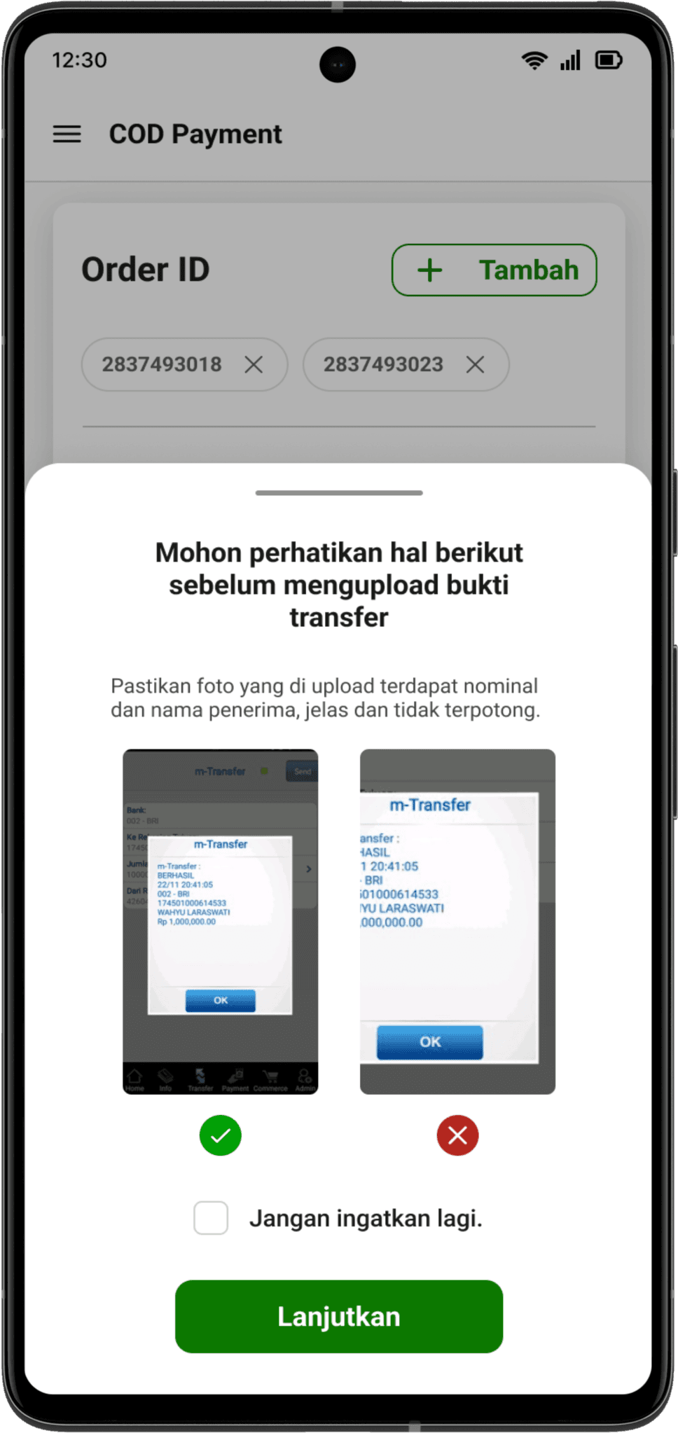
Pop-up Guidance
A pop-up is presented when user is about to upload a photo to inform users about photo upload guidelines.
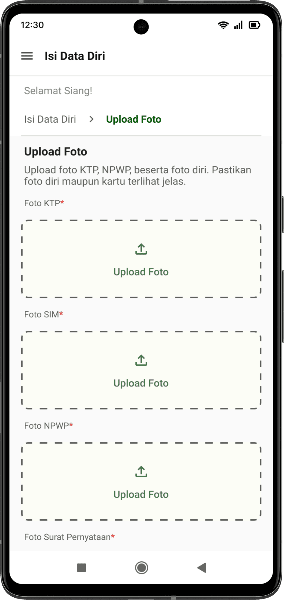
Data Verification
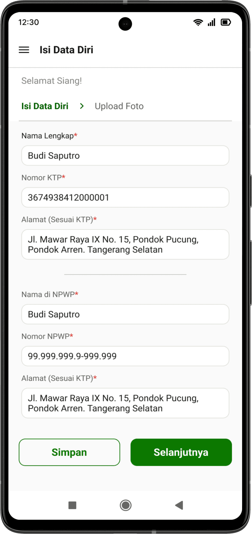
Simplify Form-filling
Simplify and reorganize the form-filling process using breadcrumbs to inform users about different sections in the form.
The user is able to save the progress of the form-filling by clicking the “simpan” button.
Simplify Form-filling
Simplify and reorganize the form-filling process using breadcrumbs to inform users about different sections in the form.
The user is able to save the progress of the form-filling by clicking the “simpan” button.
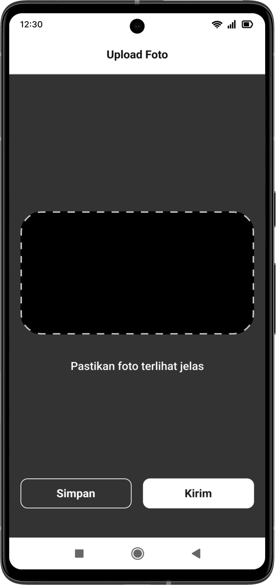
Photo Upload Guidelines
Photo upload guidelines to make sure the user takes the photo of the cards around the frame. This will speed up the verification as checking is done faster by the internal KYC team.
Error Messages
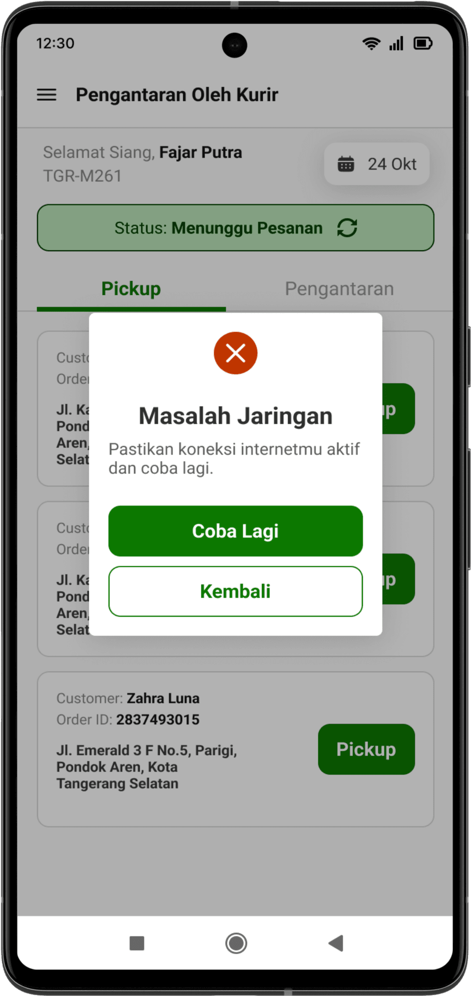
Errors from user’s side
Enhance the writing to be more understandable, user-friendly and actually informs users what kind of error they are encountering. Users’ frustration can be eased because they are aware of the error they encounter.
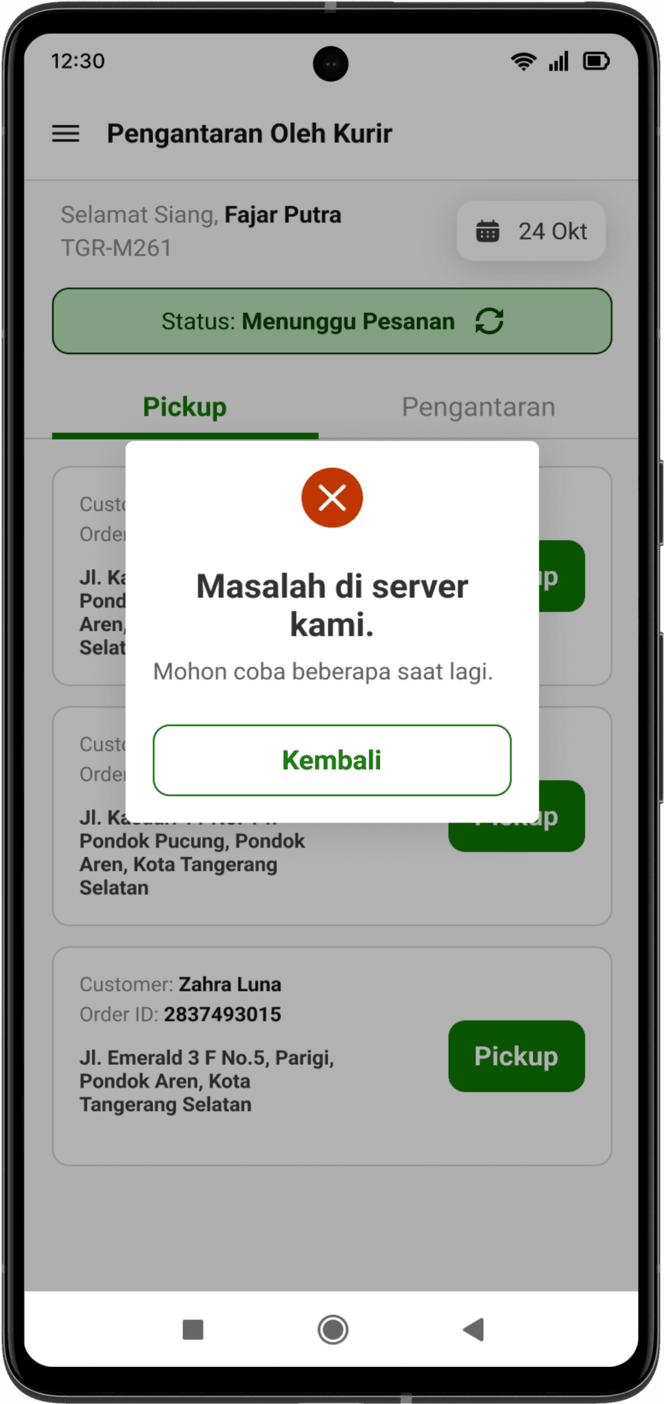
Errors from internal’s side
Internal errors, while sometimes unavoidable, can disrupt the rider's workflow. The following example illustrates a typical error message and highlights the importance of simple messaging that ease users’ frustation.
05 / Feedback and Reflection
Here, we share feedback gathered from stakeholders and users, along with our reflections on the design process.
“The overall interface is a huge change compared to the previous one. Far simpler and not complicated unlike the previous ones.”
“Flow is easier to understand even for beginners.”
“Simple and neat design.”
Reflections
This project marked a significant milestone: my first major redesign. The learning curve was steep, navigating everything from user research to visual design while managing the complexities of a large-scale project. But that's where the real growth happened.
I knew that designing a truly effective app for Segari's riders required more than just user interviews. I needed to understand their work environment and the challenges they faced on a daily basis. That's why I visited several of their warehouses, observing their operations and learning the ins and outs of their logistics process. This hands-on research was essential for informing my design decisions.
When it comes to user interviews, conducting user interviews with busy delivery riders presented a unique challenge: how to gather valuable insights in a limited timeframe. I quickly learned the importance of crafting concise, targeted questions that were easy for riders to understand, given their varying levels of tech literacy and the time constraints of their demanding schedules.
This project was a challenging but incredibly rewarding experience. I learned the importance of adapting to user needs, understanding complex operational processes, and embracing the learning curve of a large-scale redesign. I'm grateful for the opportunity to have contributed as a UI/UX design intern in Segari and excited to apply these lessons to future endeavors.
Thanks for reading! ✦